 |
| Figure 1 |
The outcome is too obvious to be able to use on a piece, it identifies too instantly with the gay pride flag. Which was an important part of the brief to make sure it is visually evident without overbearing. The use of multiple layers allows for a slight gradient between the blocks in a more contemporary visual than the flag laid out plainly.
 |
| Figure 2 |
The bars were broken into different steps, as well as taking away from the traditional structure of the flag itself this gives the opportunity for the individual colours to show better on the darker background. This is also a good way of representing visually that each part of the LGBT+ flag relates to a certain area of the community, without completely separating them, this is an important part of the meaning behind the visual so therefore should be retained.
Further Object Experimentation:
After considering the fact that the colours must not be separated but the shape must be altered I began to explore the placement of the bars. Ensuring to encompass the flag design but without making it evident that the flag is the focus, whilst still ensuring to keep the order and meaning in mind when designing, to not diminish its reasoning.
 |
| Figure 4 |
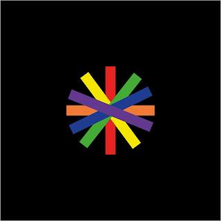
Figure 4 shows a development that creates a circle. A circle has been used due to its connotations to equality, one whole object, with one edge and an equal distance from the centre point. This is a nice concept to be able to replicate in the object that will represent the branding, as the event is regarding the rising equality and representation of the LGBT+ community in media, gaining equality of representation amongst their counterparts. In order to avoid the object becoming a rainbow wheel, in fear of it losing its link to the LGBT+ flag, I decided to create it using the bars from the original explorations. Through layering, I was able to achieve the same order of colours from the flag using depth, although when placed in this way the structure loses the identity of the flag as a whole in terms of its equality and representation of the groups through colour, an attempt to combat this I attempted to remove the block colours and leave the outlines as done in the previous exploration. As can be seen below.
 |
| Figure 5 |
 |
| Figure 6 |
In-situ experiments:
In order to see what the visuals represent the event best when put into the context which they eventually would be seen in I decided to quickly mock up some posters. Disregarding type choices and text, in order to see how the concept as a whole would stack up against the other two that will be produced. I don't feel as if any of these experiments are strong enough to visually represent an identity for the event and the audience that it will need to attract. I believe that the experiments in which the colours were stripped back to solely relying on the outlines had the strongest visual link to the existing visual literacy surrounding LGBT+ community but also fitted the brief in allowing for a corporate identity feel. Within the circle and displacement explorations, I feel as if the concept is lost. This is something I wanted to steer clear of when creating this branding, as I believe when it comes to an event of this calibre the visuals of the event itself needs to speak for itself, without the accompainment of text if needed.


No comments:
Post a Comment