Thursday, 24 January 2019

CC - Previous Branding

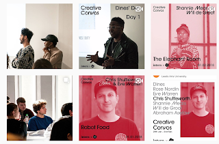
The overall theme was simplistic and consisted of a red tone throughout, taking the images of the different guest speakers and creating a duotone over their imagery. The typograpy was simplistic and allowed for hierarchy in the way it was presented through the use of different weights, ensuring all of the speakers were kept present in all content, but the main information was bought to the forefront. This is a consideration that I would like to take into consideration with our design.
Althought the design works, I don't think it works alongside the imagery of the other posts within the instagram because of such contrasting visual styles. I believe the use of white, although highlights the colour scheme, makes the work seem empty and quite vast. This is something I will be taking into consideration as I want the visuals to seem fun and engaging reflecting the nature of the event itself.

Instagram Profiles

Instagram feed

Announcments GIF

Instagram layout

No comments:

Post a Comment

OUGD603 - Statement of Intent

I am a graphic designer with a great interest into branding and visual identity, using a mix of modern and traditional styles in a sophisti...