Just like your personal identity makes you uniquely you, your brand identity is the special sauce of your business that sets you apart from every other Tom, Dick and Harry, Inc. on the block. And your brand identity design? It’s what shapes your company.
But what exactly is brand identity? What does it have to do with design? And how do you shape a strong brand identity that takes your business to the next level?
- Brand is the perception of the company in the eyes of the world.
- Branding involves the marketing practice of actively shaping a distinctive brand.
- Brand identity is the collection of all brand elements that the company creates to portray the right image of itself to the consumer.
How to create a strong brand identity:
Before designs can begin to develop there needs to be considerations about the key elements the make up the brand -
- Your mission... what is the brands 'Why?'
- Your values... what are the beliefs that drive the company?
- Brand personality... if the brand was a person, what kind of person would they have?
- Your USP... how do you differ from the competition?
- Your brand voice... if your brand was a person, how would they communicate?
Further Considerations:
Your design assets are the tangible elements that will determine how your brand is perceived. Things like your logo, your packaging, your web design, your social media graphics, your business cards and the uniforms your employees wear.
Developing your brand designTypography- Serif fonts (like Times New Roman or Garamond) have what look like an anchor (or to some people, little feet) on the end of each letter. This classic typography is great if you want your brand to appear trustworthy, traditional, and just a little old school.
- If “serif” is the foot, “sans serif” is without the foot. Sans serif fonts (like Helvetica or Franklin Gothic) are letters that have smooth edges and lack the anchor or “feet” of their serif counterparts. Sans serif fonts give a more sleek, modern feel to brands.
- Script typography emulates cursive handwriting (so much for all those cursive lessons in elementary school!). These fonts (like Allura or Pacifico) can be a great way to add a luxurious or feminine feel to your brand.
- Display fonts are kind of in a league of their own. Each display font has a specialized element, whether it’s an unusual shape to the letters, outlines, shadowing, or a more artistic/hand-drawn edge (think Metallica’s lightning bolt font). Want to make a bold statement and create a brand identity people won’t soon forget? Display font is a great way to do it.
- Red: Red is the colour of passion and excitement. It’s a perfect choice if your brand identity is loud, youthful, and exciting.
- Orange: Orange is another high-energy colour and is great if you want to appear friendly and playful. It’s used less commonly than red, so will also make you stand out.
- Yellow: Yellow, the colour of sunshine, is all about happiness. The cheerful vibe makes it a good choice if you want to feel fun, accessible and affordable.
- Green: An incredibly versatile colour, green can be used for just about any brand. Culturally, though, when people see green, they think two things: money or nature. If your brand is tied to either of those things, green is an especially good choice.
- Blue: The most universally appealing colour in the spectrum, blue can help your branding to appear more stable and trustworthy, so if you’re looking to appeal to a wide demographic—and get them to trust you in the process—go with blue.
- Purple: Purple is the colour of royalty, so if you’re going for a luxurious feel in your branding, this a safe bet.
- Pink: Right or wrong, pink is culturally tied to femininity, so if your brand is targeted towards women, pink should be a definite contender for your brand colour. It’s also a great colour for brands with a soft or luxurious identity.
- Brown: Brown is perhaps the least use colour in all of the branding, but that could actually work to your advantage! Any time you do something different, it helps you stand out. Brown can also help people to view your brand as rugged or masculine.
- Black: If you want to be viewed as modern or sophisticated, there’s nothing as classic and effective as black.
- Round shapes—like circles, ovals, and ellipses—are all about the warm and fuzzies. Brands that incorporate round shapes can create feelings of community, unity and love. The rounded edges can also be viewed as feminine.
- Straight edged shapes—like squares, rectangles, and triangles—make people think strength and efficiency. The no-nonsense lines create a feeling of stability and trustworthiness, but you need to be careful: if the shapes aren’t balanced out with something fun, like dynamic colors, they can feel impersonal and fail to connect with your customers.
- Straight lines also have their own implications: vertical lines suggest masculinity and strength while horizontal lines suggest tranquility and mellow vibes.

- Clearly communicates who you are and what you value as a brand;
- Is visually appealing: simple, clean and uncluttered goes a long way;
- Is classic, not trendy: the last thing you want is for your logo to go out of style in 6 months;
- Plays along with your industry’s standards—and if you veer off, do so deliberately;
- Makes a lasting impression on your audience.


In other words, nailing your design = nailing your brand identity = building a successful business that’s an accurate representation of who you are as a brand.
So, how exactly do you nail your design and build a brand identity that will take your business to the next level?
Before you start creating your design assets, you need to start from the ground up and lock in the basics of your design structure: the building blocks of your brand identity.
The building blocks you’ll want to determine before you create your design assets include:
The typography you choose will say a lot about your brand, so choose wisely.
Next up is colour. People—your potential customers included—have psychological ties to different colours, and using colours strategically in your brand colour palette can have a serious impact on how your brand is perceived by your audience.
Here are what the colours of the rainbow (plus a few extras) can do to help your brand identity:
When it comes to your designs, you also want to think about form and shape. This subtle but effective element that can be used to reinforce the desired reaction from your customers: so, for example, a logo that is all circles and soft edges will inspire a very different reaction from a logo that’s sharp and square.
Here’s how different forms can shape your brand identity (pun intended):
Once you’ve figured out the building blocks of your design, it’s time to work with a designer to bring your brand identity to life and translate who you are as a brand into tangible design assets you can use in your marketing. Your brand identity can be expressed in any number of elements. Depending on the nature of your business, one asset or another may be more or less important. For example, a restaurant should put a lot of thought into their menu and physical space. A digital marketing agency, however, needs to focus more on their website and social media pages.
Common elements of brand identity include:
Your logo is the cornerstone in your brand identity. When working with your designer, you want to aim for your logo to tick off the following boxes:
You also want to make sure that your design partner delivers your logo in multiple formats (like a black and white version or multiple sizes) to ensure you always have the logo you need—and that each is in line with your brand identity.
Your website is one of the most representative aspects of your brand identity. Especially if you’re running an online business or a digital product, your customers will definitely check your website out before deciding to do business with you. Your website is where your brand identity should come through in full force.
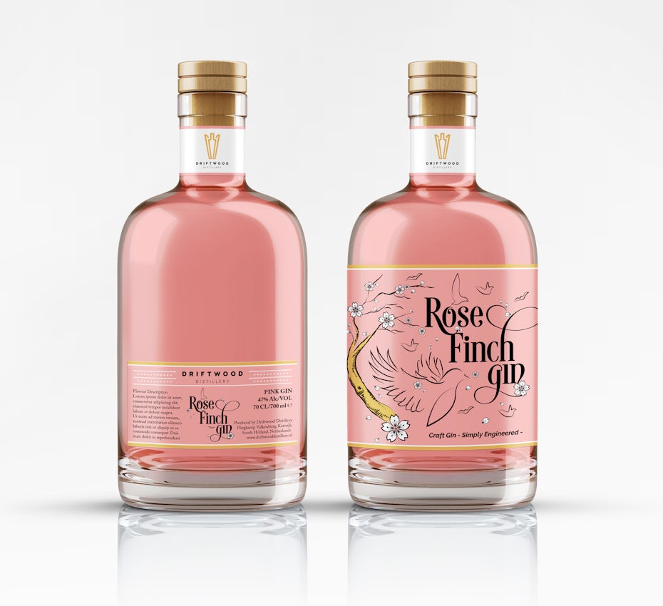
If your product is a physical one, then product packaging is key to attracting the right customers. Whether you’re thinking about the bottle of a cold-brew beverage, or the mail you’ll send to your customers who purchased clothes from your ecommerce business, don’t underestimate the value of good design in improving the experience – and driving both loyalty and repeat purchases. Packaging is an awesome opportunity for your design to shine.
If you’re doing any sort of business development (and who isn’t), you’ll want to stock up on business cards. A well-designed card offers the chance to reinforce a positive opinion of yourself in the eyes of potential clients or customers. When it comes to business card design, keep it simple: your company logo on one side of the card and your key personal details on the other side should suffice.
Email is a great way to engage your customers and drive business. But most people are at inbox overload, so if you want to grow your business via email, you need the right design strategy to set yourself apart from the clutter. Think about the purpose of the email. Are you trying to make a personal connection? Then keep it short, sweet, and simple. Are you trying to educate? Then format it well so it’s easily readable and scannable and add a few images to make it pop. Are you trying to tell your customers about a new clothing line you launched? Make a few stunning product images the focus.
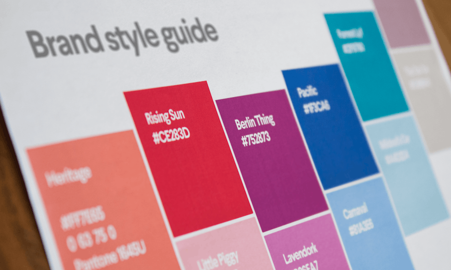
Once you’ve got your design assets, you want to make sure they’re used in the right way, which is why you’ll definitely want to create a brand style guide. This document—which outlines your design assets, when and how to use them, as well as any design do’s and dont’s for your brand—will ensure that any future design is in line with your brand identity and generates the right perception with your audience.


No comments:
Post a Comment