Research and Analysis of
Current Vintage Stores
After deciding to create a vintage clothing brand, I have
chosen to look into some of the current industry leaders in vintage fashion
reselling; this analysis of both their brand atheistic and the way in which
they present themselves to their target market will give me a clear
understanding of why they’re successful in what they do. This will help inform
me in my design decisions towards the branding of my vintage clothing store.
COW VINTAGE
 |
| Cow Vintage Logo |
 |
| Cow Vintage Look Book |
'Cow Vintage' is one of the market leaders in
vintage resellers currently with stores in 5 major cities and an expanding
global website delivering to every country worldwide. They have also progressed
to have concessions within market giant Topman/Topshop. This success in sheer
size shows COW are doing something right. Their clean cut simplistic design
with striking yellow contrasts each other leaving the consumer with a memorable
distinct flavour for COW’s brand focuses. COW themselves promote reinvigoration
of clothing bringing them back to fashion. Although a vintage store COW does
not withhold traditional vintage values such as cheap prices and car boot sheek
interiors. This is represented in their logo and logotype through their
consistent use of Arial Black for their font, it is widely recognised as one of
the most basics of fonts; their branding either uses the typeface in upper or
lower case on all branding. Persistent use of one typeface in different
contexts or variations gives the company brand identity. This is something I am
thinking about experimenting with in my work. COW’s target market is early to
mid 20’s and students, their logotype is representative of this through the use
of a modernistic concise font, making their marketing and promotion materials
clear that it is part of the brand. This is then further supported by the use
of white space in their square logo, putting all focus on the words it contains
and drawing the audience’s eyes the statement “WE ARE COW”. The use of a medium-loose
kern also reaffirms this visual atheistic that the brand are focusing on, as it is
on trend and perpetuates clarity.
Blue Rinse, Leeds
 |
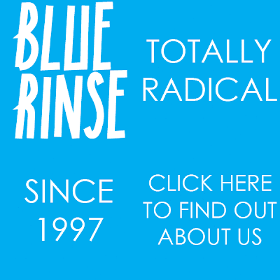
| Blue Rinse Logo/GIF |
Blue rinse is a smaller vintage clothing reselling
company, with only two stores and a smaller online presence it gives me a good representation
of how I should be branding my company. It also gives me an accurate
representation of how the branding in the store is used, this is because I have
been into the store and looked at the way in which the logotype is used in
context. This logo similar to the COW one focuses on making the context the
visual focal point of the image, this is done through the use of blue against
white text; the eye is drawn to the blue first due to the amount of space it
takes up in comparison to the text. This is less simplistic than the COW logo,
but this is also representative of the brand identity. In terms of visual
merchandising blue rinse are more eclectic and random. This is an element I need
to keep in mind when designing my logotype, I need the typeface and placement
in context to coincide with the aesthetic of the brand. This idea of the brand
identity being represented through their logo is also conveyed in their use of
a playful typeface none of which has any vertical terminals, giving this rough
sense of almost not caring about tidiness. None of the typeface sits on an
equal baseline, once again giving this handmade look to it. The use of this
typeface portrays to the audience that the vintage store is ‘mismatch’ and ‘playful’
which is the basis of traditional vintage fashion; yet I need to take into
consideration that the industry is moving away from this idea and creating a
generation of clean cut almost clinical vintage style stores, therefore their
graphic design should visually represent said values.


No comments:
Post a Comment