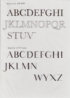
In response to my brief I initially looked at
basic anatomy of both Baskerville and Helvetica, this allowed me to get a better
understanding of how I could take elements from both and create a typeface that
will be relevant to modern display font designs. From said research I decided
to take the serifs away, this instantly gives a more modern look to the typeface.
Although when nothing else is changing only the serifs are removed from
Baskerville it begins to look like Bodoni. At which point I decided to only
take away the serifs at one point on each letter form, this creates a new
smooth point in its letter giving it more humanistic look of Helvetica.
Although due to the points at some serifs sit at made the latter forms look
like similar ones in the alphabet. At which point, looking back at my feedback
it was mentioned multiple times I should experiment with line width - therefore,
this was my next exploration. High contrast between thin and thick line
weighting is on trend at the moment with typography, therefore making this
design relevant current display trends. This a types I would like to try and
further experiment with by making it into a digital rendition.
I was also considering the use of depth in
my work, this is when I began to consider the possibility of using the silhouette
of both letters. By overlaying them they allow me to create a new typeface
which has interesting contrasting sharp and smooth intersects.


No comments:
Post a Comment