Monday, 20 November 2017

OUGD504 Module Evaluation

Overall from both of the studio briefs I have gained a greater understanding of the way in which production methods alternate depending on the needs of the consumer but also the format in which the media needs to be presented. Studio brief 1 was hard to grasp because of the last minute changes which were not notified about followed by a knowledge about the subject I was designing for an no way of possible engaging with it in the way that is needed as we were told to do something that is personal. As we were told this is how it would be in industry, when receiving content for design in the industry it is expected and organised; it did not provide a realistic experience and was an extra unneeded stress which we could have been easily informed of at an earlier date. 

Once the content was properly understood and researched into I was able to begin to understand the direction of design I was going for we were given another brief and forced to move on. Although the brief in terms of the process of making a book gave me a greater understanding of the process and time taken to professionally make a publication to a finished product from design by hand. It also helped highlight to me the difficulties that may occur when in the production stages e.g. having to print, spot varnish and bind my book more than once because of selecting the incorrect binding methods. 

The second brief was interesting as it is not an avenue I had even thought of exploring within design before. Due to a lack of knowledge in terms of the software required to prototype it took a while to get into the swing of designing for a user experience interface, I would hope that the IT department are soon going to hold workshop sessions for XD. Although in saying that the experience of teaching myself the software was a good one and allowed me to learn from the mistakes I made, through doing so both my illustrator and photoshop skills were improved. 


As a whole I feel as if the module helped me develop as a designer, although I would have greatly appreciated some more tutor led sessions in terms of the creation of the UID project as it was something I didn’t particularly feel like I had much guidance in. 

OUGD504 Design Boards

Sunday, 19 November 2017

Design for Screen - Evaluation

Overall my app design achieves the brief I originally created, it allows the user to set filters to find artists even down to being specialized within a particular field and knowledgeable with a particular software. The app forces the user to match and message the other person to be able to use the app itself, therefore encouraging the user to want to find artists to work with. I kept a design consistency throughout the app by using colours that stimulate creativity and a sense of international collaboration, the design features a modern strong logo and typeface evident throughout; giving the app easy legibility. Simplicity and modernity are kept throughout the app to keep the focus on the work this is evident on the home screen where the artist’s work is the main attention of the page putting the attentiveness of the user purely on the work of the possible collaboration.

To improve my final outcome, I would have experimented with using different user interfaces to allow the app to be open to the largest audience as possible. I also would like to investigate further into adobe XD if I could design the app directly from there. If we had more time available I would have used after effects to improve the transitions on the app, such as the menu swiping out when the user clicks the button and adding other effects such a movement in the graphics. This is something I will be spending more time on in future projects, putting the work into different software to see the way I can stretch and adapt it.

Studio Photos


Design for Screen - Type Choices


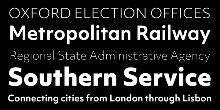
Objektiv is a typeface based around looking at the geometry of the letterforms. It has efficiency and minimalism in its basis of its design. It’s perfect for screen design because of its thick line eight and clarity making it ideal for use within titles and the body and the line weight could be altered to give a sense of hierarchy.

Design for Print - Type choices

Bodoni 72 Bold
I chose to use Bodoni within my publication as I wanted the design to be something that is similar and familiar to the audience to be able to trust in the information the book is giving them, Bodoni being a classic and heavily used type provides this factor. The personality to the contrasting line width and rounded nature to the characters coincides with the traditional ways of living shown in the images of the book yet contrasting against the modern simplistic style of the layout, therefore creating an interesting juxtaposition; making it idea to create a memorable impact for the titles of the book.


Mr Eaves
Mr Eaves is a new typeface, this contrasts well against Bodoni and makes the difference between the heading type and the body text more evident. The typeface is minimalistic but has some humanist characteristics, such as the small x height makes the type easier to read and gives a tight visual when used in a small paragraph this will contrast against the vast amount of white space around it, highlighting the negative space and enhancing the impact of the photos and spot varnished images.

Final Crit

Pin Up
Within our crits we printed our work and pinned it up, I also presented my app promo video as I think it gives a better visual demonstration of how the app works and its capabilities.

Feedback:

Positive:
Gorgeous aesthetic
Professional and easy to navigate
Colour scheme works well
Good concept for people to get out there
Ability to shift photos within the profile works well so you can present yourself in the best light
A good typeface is modern and on trend but doesn’t distract from the work the artists are presenting themselves.
Love the colour scheme
Good concept to be able to archive some artists to refer to at a later date


Improvements:
Quick description at the beginning of the video

Explore with different UI e.g. possible iPad app and android

OUGD603 - Statement of Intent

I am a graphic designer with a great interest into branding and visual identity, using a mix of modern and traditional styles in a sophisti...