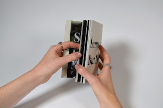
Overall, I believe the book has been
successful in terms of fulfilling the client’s needs and the book takes on
board not only the concept behind the book but also the takes into consideration
the content in a way that is visually evident. My minimalistic style throughout
the book keeps the focus on the content itself and visually tells the audience
that the focus needs to be on their own personal journey and cultural
development, rather than the more typical guidebook which simply guides the
person to various locations. The stock I chose was cheap enough to keep the
book available and assessable to all of the target demographic, yet still
durable enough to fulfil the purpose of supporting tip ons, and being a
regularly used interactive reference. The book itself is about the person
themselves making the content eventually about themselves through recording
their journey, the photo placement corners all the audience to have a platform
to do so. My binding considerations were changed and developed throughout the
production method of the book, although this was testing it enabled me to
develop as a designer and gain a greater appreciation for appropriation importance
when it comes to binding. This would be something that I will test more in the
future, as I will be able to gain a solution to the design problem at hand in a
more concise manner. Yet the binding I did end up creating was appropriate and
justified with the concept and design of the book. The choice of type used
throughout the book keeps the content clear and easily legible, yet the deep
contrast between the line weights and characters of the heavily serif’d Bodoni
type adds a sense of class and modernism to the piece. Not only does this add a
visually sophisticated feel, but also enables the audience to have more reliance
in what the content is saying. The minimalistic feel to the exterior of the
book gives away the atheistic of the content, as well as keeping it almost a
mystery, further playing on themes of making the content subjective and
interactive; the more the user does with the book the clearer the content
becomes. These themes are further evident within the covering of the content of
the book as well as the manipulation on the full bleed double page spreads.
If this book was mass produced some of
the methods I had included, such as spot varnishing, would need to be taken
into consideration as doing it by hand took more time and would increase the
sale price of the book. Yet industry equipment would be able to resolve this
issue.


No comments:
Post a Comment