 |
| Figure 1 |
 |
| Figure 2 |
 |
| Figure 3 |
For the cover of my book I wanted to create a full emersion of what is to come in the book further on, the full bleed images do this. They give the audience and initial excitement about the content of the book while also giving an instant insight into the beauty of the location that, that particular book is made for. The second cover development I used a black and white to create a sense of intrigue the image is still evident but to further see the actual content and the suggestive guide of the place the book is for on the inside only. The title is aligned to keep it the focus of the book, further reinforced with the use of a none opaque section that draws the audiences eye towards the center section. Although I don’t feel as if this design works best for the book. The design strikes me as a traditional guide book, which is something I wanted to move away from with the book and make it more suggestive and interactive. The third exploration sees the saying ‘same, same but different overlaid over the images’ with the rest of the title centered. If the books were to be developed into a series the saying would change each time depending on the location; therefore this could be a theme that runs throughout.
Cover Inspiration:
- Journal Style
- Traditional design links
- Handmade style linking the interactive nature I'm adding to the book
- Elasticated string in the centre holds the book together
Final Cover Development:
 |
| Final Cover |
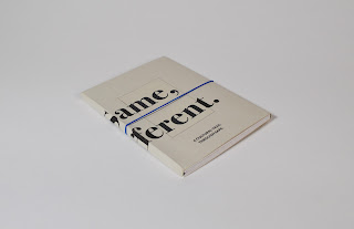
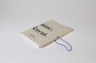
My final cover shows a more simplistic version of the developments above. Within my crits I was told that I should remove the images from the cover, to tie in with the concept of keeping mystery and intrigue for the audience to get them to involve themselves with the environment they’re in, rather than just being told what they’re seeing in the book. The type on the cover has been in kept with the rest of the titles throughout the book. The two parts of the title has been separated as if the book was to be made part of a series this is something that would change to a saying for that particular region or country. The additions of extra flaps either side are additions to the cover the one on the left-hand side will be folded into the back cover, this will create a pouch to be used for the user to hold their images in before placing in the photo corners that come with the book. On the right hand side, the flap will have a hole punched through to make space for an elasticated band to be placed around the book, keeping it together and making it more tactile and durable for everyday use. The band holding the book will also make the added content to be protected.
The centre of the front cover also has a border, the same size as the polaroid throughout the inside of the book, this will be filled with spot varnish to add a sheen to the layers underneath.
In terms of stock, I will be printing on a recycled naturally coloured paper, this keeps the book simple, yet is representative of the neutrals found in the environment of Sapa. The greens and browns in the paper compliment the imagery within the book whilst contrasting against the bright whites and dark blacks within the book. The use of this stock also contrasts with the very digital and sharp type which will be printed on it, making more of a visual impact on the first impression.
The elastic that I have used within the design is indigo, as indigo is a color that Sapa is famous for producing the dye of. This again, similar to the saying, is something that would change throughout the book depending on where the book is aimed towards, being a colour to either represent that region or country.


No comments:
Post a Comment