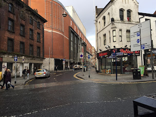
As part of my research I wanted to investigate
the use of wayfinding systems in a different city to see if their systems had
any differentiation. Whilst in Manchester I took photos of signs found around
different streets.
These signs were found on a lamp post to
inform drivers about parking in that particular zone of the street. Different
to the Leeds systems I found on the roads, yellow stands out more than blue and
the black writing contrasts more than the white writing against the blue
background. This makes the information clearer, although due to the size of
their sign in makes the information almost redundant. The sign to be able to
serve its purpose must be larger because of its audience, moving vehicles, this
may be why there is a differentiation in colour to compensate.
This is a signage for a junction on
accordion Manchester. The signage is clear and concise, being largely white
background, with blue pictograms and black type. It is a categorical
generalisation, in terms of it not being exact with distance and location. This
highly successful in its purpose and placement.


No comments:
Post a Comment