Feedback
In order to gain feedback from the client I decided to send
over the designs, as can be seen, in my previous development. Their feedback was
that they felt the design was not representative and officially of a crown
shape, although due to the fact that the leaf tops made the points of the
Crown, they felt a 3-D element would allow for a better representation. In
order to keep the 3-D element part of the peace and able to be more a representative of an actual crown, at stake into consideration the simplicity
factor which was a major part of the development within the branding, in order
to stand out of the crowd in terms of their local industry.
Feedback Response
 |
| Figure 1 |
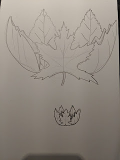
Whilst gathering this feedback and began to sketch down
ideas of the way in which could incorporate the design I had already created
into a 3-D manner. This can be done by the changes that can be seen in the
sketch above. Adding the veins down the centre of the leaf themselves rather
then the centre allows the sense of the lease being on its side, to taking
the outer outline and duplicating it slightly more to the right or left of that
particular leaf it would create the effective belief being bent round in a 3-D
manner.
 |
| Digital Development |
Through digital development I decided to to remove the veins
on the side leaves altogether simply through the use of the repetition of the
outline pattern slightly changed in proportions, the effect of being 3-D is
given therefore the extra complication of adding veins to the leaves is not
needed. Further implementing both feedback in which I received from the client
and also the strategy of keeping the logo as simplistic as possible in order to
gain notoriety for the new business.
Type Experiments
 |
| Oval Experiment |
 |
| Horizontal Experiment |
Due to the new shape of the digital development of the logo
which produced I decided to complete a couple of type experiments. The first of
which took the type into an oval shape around the logo, this more resembles the
outline of the actual leg of itself and therefore gave a sense of continuity in
terms of shape. Although I believe the circle works better in terms of the logo
due to the visual coherency that circle gives. A circle can be translated into
many different formats to be able to be used within printing and production and
also keeps an element of simplicity due to its equal nature around it. Whereas
an oval may be awkward to place in some respects.
A completely horizontal experiment was also completed in
order to combat the issues of placement. This offers too much of a structure
which contrasts against the nature of the logo mark itself and therefore is
unsuccessful.
 |
| Circle Experiment |
I also attempted to use a circle outline to border the texts
and the logo markets have to offer more the badge style logo. Although this
looked off alignment due to the uneven shape of the logo itself. Due to the wider
shape of the logo, this is actually scented within the middle of the circle,
but it looks as if it is off. Therefore, it was decided just to have the circle
texts outlining the logo mark itself.


No comments:
Post a Comment