To be able to create a strong brand identity that could be used across a multitude of platforms and remain identifiable, as well as create a strong visual notoriety for the artists face, being new to the scene; I needed to create a base of images.
The images for the actual brand identity that could be edited and slotted into different situations should be clear, almost headshot like images. Due to the nature of the EP cover that is required from the brief, there should also be a type of image that can be used as part of the cover. The image must be different from the imagery that will be used for the brand identity, as I want to make it evident that the EP is relevant to the branding, but also identifiable as its own standalone body of work. Due to time constrictions, I will be using one photoshoot to be able to capture both style of the image required.
As the artist is from Birmingham, she will be travelling to Leeds for the day in order to take part in the shoot and to be able to utilise the universities facilities. For the desired style of each photo that we require the photoshoot will be taking place in the studio. In order to gain the best results, I have requested the collaboration from Courtney Richmond, a second-year fashion photographer, whose style would fit well with the required needs of the shoot.
In order to prepare for the shoot, a large studio was booked, giving us the chance to experiment with different types of compositions.
As the artist wished the EP cover to be open and quite obvious, we began to discuss ways in which we could say this through visual literacy. Our discussion led to the conclusion that florals would be a good way of enabling the desired outcome, florals represent a ‘strip back’ to nature vibe. Similar to the way in which the music itself is very open and stripped back. This is something that could be used to visually speak what’s on the artist's mind, as seen in previous research. This visual literacy also relates to the title of the EP itself ‘Black Rose’.
Rather than creating this imagery through the use of physical flowers we discussed the experimentation of using projections, as we were in a studio environment this would be possible. This technique would allow us to experiment with various textures and different imagery and opens up the possibility of even creating a piece of moving image that could be used within the promotion of the EP itself.
Projection Photography Examples:


Artists such as Davis Ayer experiment often with projections to create new and interesting styles within their works. The examples which can be seen above, by Lee Kirby and Stacey Williams, focus on a portraiture style this is the type of photography I believe we require for the EP cover. It achieves elements of the brief, such as creating imagery for the cover that will be easily visually noted as part of the 'Rachel Victoria' brand, through the use of portraiture, but is different enough from the headshot style photographs required to create a base for the brand to make the cover identifiable as its own piece of work. As can be seen from these research images the best way to increase the impact of this style of image is through keeping the subject's identity as simple as possible, natural hair, minimal clothing and use of light coloured clothing if necessary, to keep the projections the focus. The fact that this is required for the photographs to be successful further implements how this style is suitable for the brief, as it focuses on keeping the artist natural, stripped back and almost vulnerable like all attributes that the artist wishes to visuall display within their works.
Images for projection:


The first type of imagery we experimented with in the photoshoot was dark, with singular bright contrasting images of singular or minimal flowers. This picks out the colour in the flower and when projected means the background will simply blend into the darkness behind as black will not be projected. Although once in the studio this imagery did not particularly work, as the images were too dark to provide enough light for a professional standard of the image. To combat this, we changed the camera used from a Canon 1300D to a Canon 5D, the higher level of camera would enable a better outcome, yet because of how low the lighting was the outcome still came out too grained to be able to use in any final content. This experimentation allowed us to test more imagery, as lighter images should be used.
Images Used:


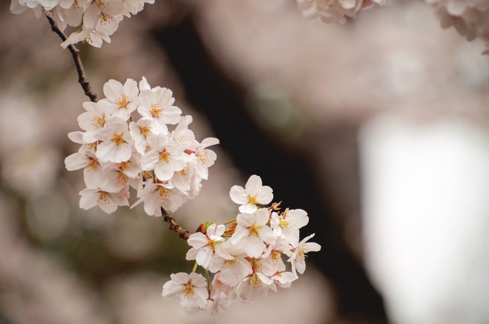


The imagery that was then used was lighter in tone, majority of the images that were taken feature cherry blossoms, this is because of the white/pink flowers. The colours in this type of flowers allowed for the desired effect of giving the images texture and depth, without taking away from the subject herself. The same rules apply with these images that would occur with the darker images, such as having the model where lighter clothing to enable the projections to capture the most accurate colours from the images. The delicate nature that is presented from these flowers, also accurately represent the visuals that the artist wants to represent on the cover of the EP. This type of imagery is only relevant to the EP cover itself, as the branding identity photography will take more of a simpler headshot type manner approach. The lighter colour shame within this imagery also allows for more experimentation with the visuals be used on the EP cover itself, as it is not too complex and therefore mean that the EP cover experimentation can include different types of imagery and textures; without making the piece to visually complex and taking away from the key visual objectives from the artist.
Contacting the photographer
As previously mentioned I will be collaborating with a fashion photographer in order to create the best images possible, this collaboration will ensure the professional ability of the content used within each of the aspects of the project is to industry-standard. Through collaborating we can also use a higher standard of the camera which will ensure the best shots within the low lighting conditions that occur when using projection. I chose Courtney Richmond as the fashion photographer I will be using, the researching fashion photographers at the University through Instagram. Once I had selected the fashion photographer which style suited the photoshoot that we will be doing I use the University email platform to be able to contact them.

Once contacted the photographer and I organised a meeting in which we discussed the way in which the photoshoot should come about. Within this initial meeting we discussed the possibility of projection and how this would be done, I was reassured by the photographer that this is a possibility to be able to be done in the studio. In order to be able to gain the desired fact we would need a particular photo studio, in order to do this, I booked out studio a in the University. This studio has an infinity and therefore would allow the outcome to have the most professional look. This was then referred to the musician, to allow her to be able to book a journey to Leeds on the correct day.
Required equipment
Due to the nature of the photography needed for the shoot, we needed the use of specialist equipment. Within the studio, the studio lights were used to gain the most natural lighting for a clear and concise headshot. This style of photograph also gives the most professional outcome in the style of the music industry needs. This photo being clear and concise and simple also allows the artist to use it for both promotion and for brand identity.
Whilst there was a need for projection in the second style a photograph that would be taken in the shoot, I was unable to get a projector from the University facilities. Although is able to borrow one from a colleague, therefore allowing the style of the photo to go ahead. If there were no budget limits on this brief I would have purchased a higher quality projection unit to ensure the best image quality to be projected onto the artist.
Canon 5D was the required camera that we needed to use to ensure that the best outcomes would come from the low lighting conditions in the studio at the time of the shoot. As we were able to use this equipment is also enabled me to experiment with videography. Once the still images of the blossoms over the artist were taken, I downloaded a series of short videos which could be leaps and experiment being projected onto the artist. This is something that I will experiment making into a promotional video which can be shared on social media, gaining both brand notoriety and promotion for the actual EP release itself.
Video Experiments


The videos that were downloaded, to experiment with at the
end of the photoshoot if we had time, in kept with the imagery use within the
photoshoot. This visual link was established to ensure that the work itself and
promotion of visually identifiable as an entity with the EP cover. Due to the
style of the music that the EP is relevant to, I asked the artist to make some
simple and free movements during the filming. This type of imagery within a
video is also linked to similar music within the genre in which the artist
identifies herself as part of. Visual links such as the way Stevie nicks
performs once on stage is the only comparison in which I can describe the way
in which Rachel Victoria’s stage presence is, therefore this type of similar
movements within the promotional video will give the audience an insight into
the way in which the artist acts when performing live, as this is the only part
of their will be moving in the campaign towards the EP.


I believe it is important to know the way in which the
artist performs as part of my research towards building visuals that best
represents them. Therefore, I took images which had been taken by fans from previous
gigs. This enables me to see the way the artist uses their body language to
best represent their music. This is something I will be including in the
videography as a believe it's important to give, a strong sense of continuity
throughout the brand.


No comments:
Post a Comment