Fortnum and Mason are known for their famous tea hall, with their main client base, not being touristic; being the high-end luxury London demographic. Making the brand ideal to consider when investigating the visual identity and presentation of tea’s to be able to remain a key name in the luxury beverage market. Therefore I conducted a visit to the store when last in London to be able to get a hands-on approach to my research and investigate the way in which the packing takes an approach to the design of their products.
Primary Images:


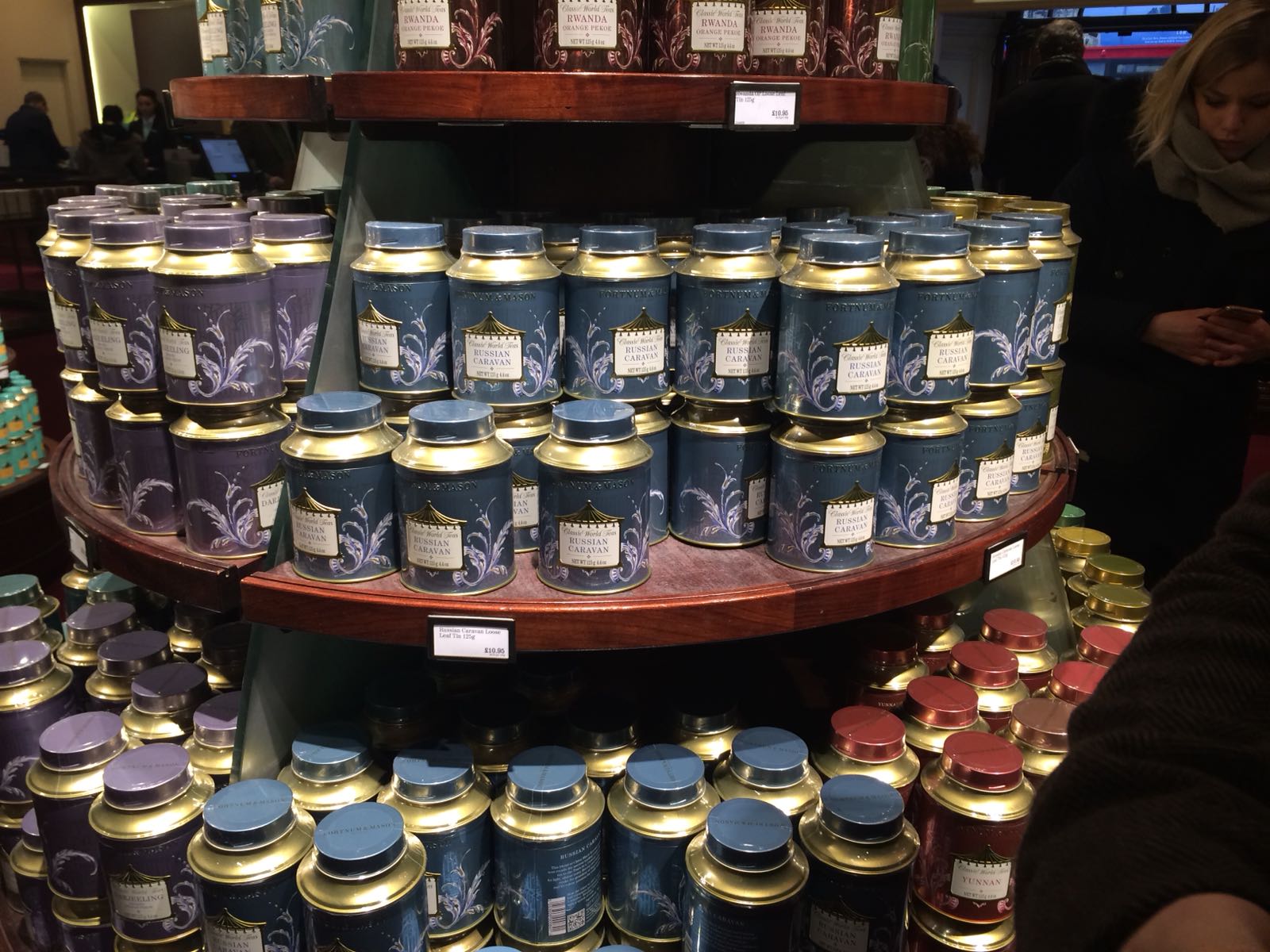
The first set of images were taken as the way in which they were formed took more attention rather than the actual design. The designs itself all remain very traditional this is something that I have found in my previous research, yet other large national luxury retailers have introduced a more modern design style to the teas they sell, in order to keep up with the changing markets buying patterns. Although this is not done here, I believe this is done as the teas which this store sells are from their own brand and suppliers, meaning they must attempt to in keeping with the brand ideals and traditions in the products they are putting out to the public. What is interesting here, even though the material used is still metal, each of the teas has a slightly different shaped tin; making them identifiable in a tactile way. Which is something other brands seem to steer clear of, that I have previously researched.


Once again, a different style of tin has been used to identify this particular range, the unique shape adds to the sense of luxury to that tea, because of the intricate shape the tin appears to be hard to make; thus, requiring more work to make and insinuating luxury. These are part of the royal blend range, therefore in keeping strongly with the traditional designs to visually represent a regal feel, again representing luxury in the way that people feel they are getting something that is approved by royalty. Bright colours have been used in this design, this I because of the way in which luxury and expense were represented in a time of this design, yet as time has moved on simplicity and modernism has come to represent elements of class and luxury.

These boxes of tea caught my eye when in the store as they were so different to anything else seen in the store. Even though these boxes are not made from metal and are in tea bags, giving a more everyday feel rather than luxury, luxury is highlighted here in other ways. The simplistic and geometric designs offer a modern view on the contents. The contents of this tea were based around different sweets and sweet desserts, e.g. The Sundae tea includes imagery based around sprinkles. This is aimed towards a younger market similar to that which I want to base my design towards, offering a luxury option that a younger market can visually resonate with on a more comfortable level.
Traditional Gift Pack:

The gift box for the metal tins are created using the same
print that is found on the tins itself. This ties together the set as a whole
and gives the brand more notoriety. This also enables the set to be able to be
given as a gift the way it is. Although the material used I believe should be
more tactile for a luxury product, the weighting and durability of what is
produced insinuates the idea of expense and a ‘lavish’ feel to the outcome. If
the material used for this outer packaging was also metal for example it would
push the brands visually recognisability, something which is supported by a
signature style as seen here.


No comments:
Post a Comment