The idea which I initially sketched out was to take the ingredients and create geometric shapes from a breakdown of them. For example with the Apple and current tea I would take the elements of the Apple such as the red body the stalk and the leaf and separate them into three different entities in which I could create a repeated pattern which would painted onto the tin. The colours would contrast against the high-gloss white of the embossed label keeping the information simple and clear for the audience, whilst also visually re-implementing what they are reading through colour and shape.
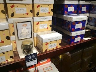
From this initial sketch I began to digitally draw up some of the ingredient elements from the first tea, I began by separating the apple to its core, on which I would create a repeated pattern with an illustrator, and mixing the other elements such as the leaf and then the currents. Although this design much the initial sketch and was similar in style to that of other luxury brands such as the Fortnum & Mason brand, I did not believe it had enough strength to stand out on the shelf as a luxury product.
Therefore to add more visual impact I decided to add a base colour hero used light blue, as this is a colour often linked with luxury brands, once again seen in Fortnum & Mason and also other luxury brand such as Tiffany's. Although this gave the label more depth the product became to look more high Street rather than luxury, through the colour scheme and illustration peers had commented on the way in which it had similarities to such styles as Cath Kidston, and was more of a surface print design rather than a packaging design. This was reaffirmed to me once I'd created a mockup within dimensions, the mockup itself did not look like a luxury tea package and therefore I decided to experiment with a different design from my initial ideas to infinite with the brief in a more concise way.
This design was typographic based although this contradicts with keeping the only type on the piece on the label, it plays on the whole concept of the tea. The whole idea of the tea is to be drunk at different times of the day therefore the typographic outside of the tin itself would tell the audience what time of the day they should be drinking that particular day. I began considering ways in which the type could be adjusted in order to make a visual focus. This led me to think about the way in which the metal could be changed in terms of the surface itself, the typographic content would go across the entirety of the tin. The label itself would be in high gloss, whereas the rest of the tin would be in a more satin effect. The mix of the two luxury textures would achieve the aesthetic needs of the brief, while also giving a sense of hierarchy to the difference between the information about the tea and the packaging design itself.
The other idea I initially sketched up was based around the colours found within the sky from the particular time to the day in which that the tea should be drunk, therefore physically visualising the concept. This can be done in a way that does not interfere with the lettering on the label and therefore keeping the focus towards the visual design itself. It would also allow for the embossing of the label to still occur giving the tin the extra textures needed, to make it stand out from its competitor products. The bottom of the piece itself would show the exposed tin underneath, giving the chance for the consumer to take into consideration the material in which the product is made out of. As the design moves up the colour would change the gradient effect representing the tones related to that time of day. Gradients is a current trend which is used throughout multiple designs, particularly UX and UI design, making it relatable and approachable for my target audience.
This is the idea I will be progressing with and creating further experimentation, as a believe it is most relatable to the type of product, concept and most approachable from the target demographic in which the product is aimed towards.


No comments:
Post a Comment