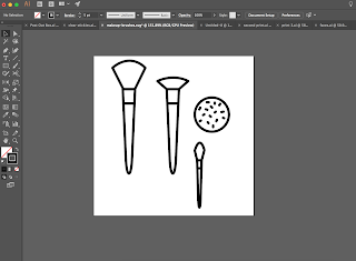
Therefore in order to combat this but still provide some information for the basics, I will be creating a simple delivery card, on which it will describe:
- how to use the make-up to create a masculine look
- how to use the make-up to create a feminine look
- a small rationale of the brands beliefs and values
- small link to the website
- description of the brushes and which products they can be used with.
This information can be put onto a card but rather than making it completely word based I would rather it be slightly visual and therefore have an extra interesting impact on the audience and have something for them to engage with.
This can be done in terms of illustration where the masculine and feminine make-up styles are separated into simple line contour drawings, the make-up should be applied in a different way depending on the luck that the user wants to achieve. This look can be developed through the lines being the same colour as the corresponding products which are needed with them.
The figures which are used with in the simplistic logo shall be also be used within this small make up visual tutorial, therefore bringing together the whole idea of the brand identity.
I will also ensure to put a comment onto the card that describes the way in which the make-up can be used in any way and be interpreted in any way, there is nothing to say that a male cannot achieve a feminine look or a female chafe a masculine look through the use of the make up.
Alongside the description of what the brushes can be used with, to clarify with new users to make up, I will also include a small illustration, yet again visuals will be the easiest way of being able to get the user to understand quickly and simply the way in which the brush should be used.
The front of the little delivering card will include a completely white background, this will be to not over their the box design itself once initially opened. The logo will also be placed onto this card in the clear vinyl setting bringing together the entire brand identity. As the male and female symbols which I created will be used in the make-up direction itself, I will print the logo which also includes the non-mainstream figure, to make the instructions more inclusive; this will also be done in the clear vinyl to not distract from the actual instructions and information that is being given.
Design:
| figure 1 |
 |
| figure 2 |
 |
| Figure 3 |
Final Card Design:
 |
| final card design |
The design will be printed onto Mount board to give it durability and tactile nature, Just as would be found on a delivery card that would be producer industry-standard. The vinyl that will be used to place on top of the card on both sides will be printed and cut accordingly in correlation with the other designs that require the physical printed vinyl.
Final will be used in place of spot varnish as spot varnish would make the printed ink underneath run and possibly rip the type of paper that the print will be done on, once again if this was done industry standard selective varnish printing would be used.


No comments:
Post a Comment