Clarity and precision of information given across this key
within creating a new brand. The audience of this brand is of the older
generation and people who can afford to be able to have the extra income to be
able to use on improving their gardens and landscapes. Therefore, these people
may not be overly concerned design itself, although will be concerned about the
brands that they bind, in order to present a particular lifestyle.
In turn, something needs to be used that is very neutral,
that will give a classy and elegant style to the business raising it above the
competition.
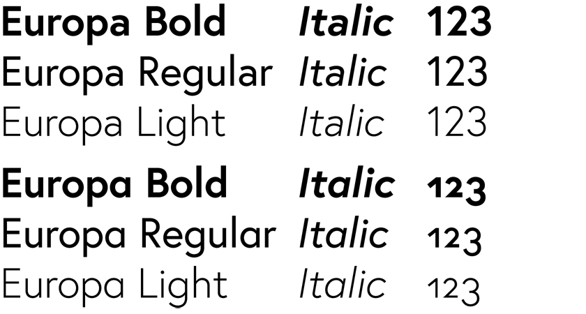
Europa has been chosen as the branding typeface to be used
across all platforms the use of consistency through only one typeface being used
allows for clarity of information that is relevant to the brand being carried
through all visual identity. You wrote contains a geometric reduction in
humanistic vitality making it a modern sans serif typeface.


No comments:
Post a Comment