Due to the nature of the event announcement posters were
also required as part of the brief. These posters will be announcing he would
be part of the panel during the event. Therefore, need to be mindful in fact
that the information in the poster needs to do include both the event branding,
in a way that is understood from the initial poster to be able to keep visual
consistency.
 |
| Figure 1 |
 |
| Figure 2 |
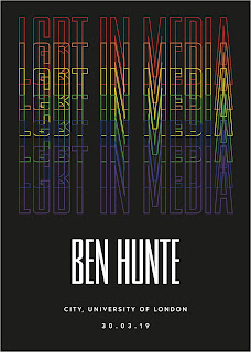
Within figure 1 a can be seen that the branding remains
undisturbed in the same style as the overarching poster. Rather than LGBT and
media have been presented in the white filled text, it is the name of the person who
will be contributing towards the event. Although this poster is clear in the
way of presenting the name of the person themselves, I don't believe the
branding of the event itself is pushed enough across within this poster, to be
able to come essay added the addition of the white logo at the top of the page
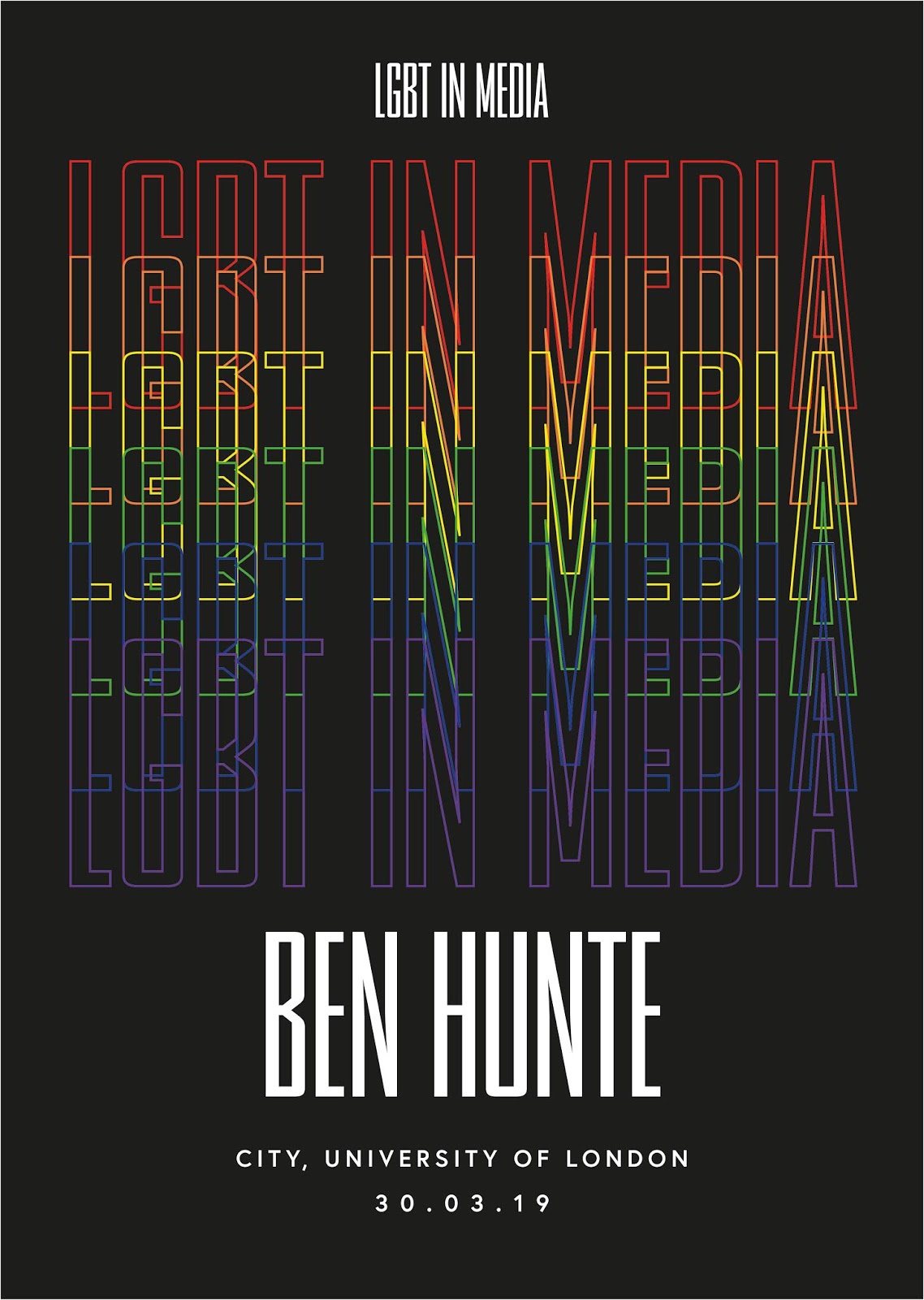
as to be seen in figure 2. This further visually ties in the event with the
initial branding poster itself. Although due to this fact everything on the
bottom of the page needed to be moved down, I believe this makes it look too
squashed at the bottom and therefore doesn't allow the information to be
presented in a way that is easily legible, something which I believe is
important within announcement post is due to the event needing to gain
notoriety.
 |
| Figure 3 |
Using figurative as a base I decided to experiment with the
branding itself, seeing how much I could push the brand identity to allow the
visuals alone to carry through the brand. Rather than LGBT in media being
repeated in the outlined rainbow colours, I decided to replace it with the name
of the person being announced, keeping the same proportions as the overarching
poster itself allows the visual identity to be so similar that the audience
will instantly know the link between the two. This is visually reaffirmed by
the addition of the white logo at the top of the page as seen again in figure
2. By altering the layout and making three filled white text presenting the
name smaller, it allowed more room to be able to present the date of the event
itself, as well as the job role of the person who is being announced. The
location could be taken off at this point as it was realised these posters
would only be presented within London city University itself, where the other
promotional posters would also be presented. Having a knowledge of the event
already meant that the event did not need to be re-on this poster rather just
the person who would be attending the event. As I felt the Stalin figure 3 word best, I decided to have
some experimentation with the layout of the poster itself. This was to be able
to see which layout best across the information and both the branding in the
same visual style that the overarching poster does. After discussion with my peers and tutors as well as deliberation,
it was decided that layout experiment 3 offered the best visual equilibrium
between the information given, the branding, and the visual identity of the
overarching poster itself.
 |
| Layout Experiment 1 |
 |
| Layout Experiment 2 |
 |
| Layout Experiment 3 |


No comments:
Post a Comment