In order to bring together the brand as a whole identity
I believe that it's important that the imagery is also consistent with the
brand, including the effect and colouring of the imagery in the way in which it
sits within the branding collateral design. I already had a basis to begin my
research about the imagery on, due to the fact that it pulled images from the
website previously to be able to look into the way that the band currently
presents itself. This is another way that I saw that the brand thought the imagery was important as currently, it is a big part of what the content of the
website includes.
The imagery found in the gallery section of the website
currently displaced both the process and the employees of the business,
including the making of the food itself as well as the office team. I believe
that these depictions are there because of the business of trying to get a
personal level with the consumer and the people are reviewing them getting
involved with the process itself by seeing how the food is made and where it
comes from, including is making it.
Key Imagery Values:
- The imagery needs to be representative of the brand's tone of the voice itself.
- Giving a warm and inviting feel.
- Allows for a visual feel of traditionalism, matching their ethos.
- Contrast against the logo so the imagery is definitely part of the brand, with or without the logo.
Image possibilities:
- Keep the original imagery.
- Convert the imagery into monochrome, to give a more traditional feel and contrast against monochrome logo's. Although it may look a bit harsh in comparison to the target tone of voice, which is to give off warm family values.
- Overlay the image over a paper texture and lower the opacity to give the feel of a more traditional image.
Brand Imagery Research: I felt that getting the brand imagery was so important for this brief due to the brand being completely new it is important to gain notoriety amongst the industry and their target consumer, so I decided to do some more research into what makes good brand identity before jumping in with experimenting.
99 Designs Article -
Think about the number of images we see every day—on our Facebook feeds and Twitter timelines, on websites we visit, in the games and apps we use on our phones. Though billboards and print advertising prove that brand imagery has always had a place in marketing, it’s undeniable that it now plays a much more important role, because of social media. If properly used, images can deepen a customer—or potential customer’s—attachment to your brand. Read on to learn more about crafting imagery to keep your content top-of-mind for customers scrolling by.
How is brand imagery different than a logo?
A logo is a mark or a symbol and it’s the most essential first step to building a brand. It is a an emblem by which an organization can easily be recognized on letterhead, signage, online and even on the product you sell. It is custom designed and must be entirely unique for simple and immediate recognition.

Brand imagery, on the other hand, is how you build your brand’s aesthetic. These images can appear in a variety of forms, from billboards to Instagram, websites to print ads. Whether modern or traditional, simple or complex, clean or edgy, these images are more than simple visuals—they convey an emotion in the viewer (known as “brand feelings.”). This often occurs on an intangible level, building trust and confidence over time and repeated exposure.
Put more simply: view brand imagery as an opportunity to communicate with your potential customer. Show them who you are, why they should trust you and how—if they choose your product— you it will make their lives simpler or better.
How do you create the best imagery for your company?
Think of your perfect customer: what is important to her? What does her day look like? If you can visualize that person and what they want, you can source better visuals that your audience will respond to. Understand and acknowledge your competitors and work to set yourself apart from them.


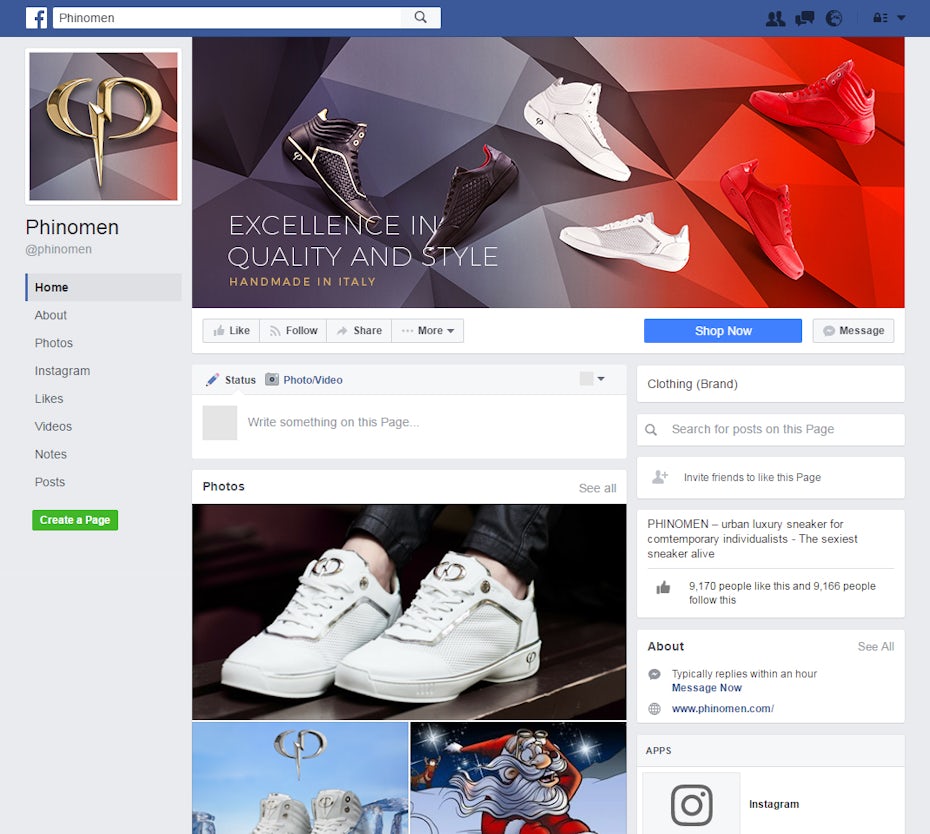
For instance, while Mercedes and Dodge are both trying to sell the same product, they are attempting to sell to two different audiences. In Mercedes ads, the cars are most often silver and shown in urban environments, with clean serifed fonts. The colour and setting evoke luxury, confidence, and technology. Dodge chooses to use red cars and often sets their cars on racetracks, with bold, heavy sans-serif fonts, to sell the idea that their cars are fast, powerful, and strong.
How are these companies able to make very similar products (cars) appeal to such different demographics?
Short answer: design.

It’s crucial to think carefully about colour, composition, typography, content and style work together to create different moods. Learn the basics of colour theory and typography to understand what message your images are sending. For example, dark colours and heavy fonts project seriousness; pale neutral palates can give a modern or even futuristic vibe.
Knowing your audience allows you to pick the design elements to focus on. Audiences are not one size fits all: your audience might react well to your logo on a clean background with a few supporting graphics, while another might only respond to on-trend animated GIFs that will make them smile. You may even want to run some tests to see what resonates. Try two or three different styles and post images to your Instagram account and see what gets the most engagement.

Once you figure out what works, stick to it. While you don’t want your images to be bland, they should resemble each other on some level—whether you choose color palette, typography or style. GoPro has built a very successful following by using images of happy, active people filming their wild adventures. The images and videos are different but are tied together by a greater unifier: the GoPro cameras capturing the footage. In that way they sell their brand (active, fun, adventurous) while also remaining consistent in their chosen style.
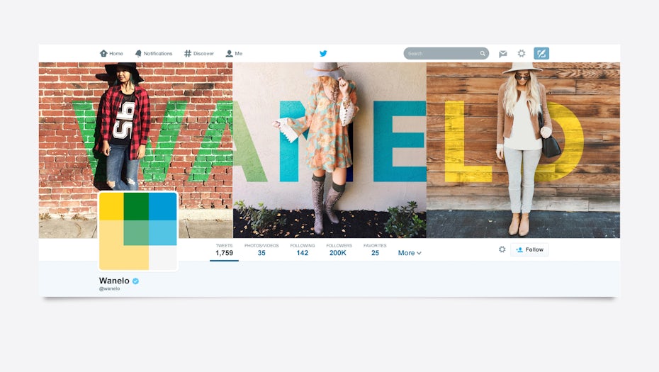
Always make use of interesting perspectives that will draw a busy customer’s eye as they scroll their feeds. Your product in an unexpected location; a bright mural that evokes an exciting environment; a unique person who reflects the look of your desired customer. Through these choices it’s possible to curate your feed into something that feels lively instead of purely promotional.
Brand imagery builds your reputation
Successful brand images can build consumer loyalty that goes beyond buying your product or service because it fits a price point or because they recognize your logo. They buy it but because of the values behind it. If you care about the environment you will be more likely to purchase a Patagonia jacket; if you are interested in a car that will last for many years, you might buy a Toyota. These are longheld, loudly espoused beliefs you will hear from people across age groups, markets, and demographics.
Build successful brand imagery and you will cultivate a loyal fan base that sees themselves in the brand. Once that happens, they will transcend being simply customers and will become ambassadors, championing your product in the outside world.


No comments:
Post a Comment