Now I have completed my research on the transport for London
visual identity itself I decided to look into some of the advertising campaigns
which currently exist. This was to be able to evaluate the way in which they
use imagery alongside text and the tone of voice they attempt to achieve.
Therefore, will also be able to evaluate the use of colour within illustration
which will influence my initial ideas.
 |
| Figure 1 |
In figure 1 bright colours is used against three
different types of style of illustration. These posters are all parts of
different campaigns although all released at the same time. Even though the
illustration themselves differ in style, the way in which the poster is
presented remains consistent. The information that is key is presented at the
top, with a small strapline/call to action. Each poster has a distinctive key
colour which it sticks to, which can be seen in the centre post away red is
used both on the character illustration and also was a shadow. This use of
colour offers a sense of depth to the piece whilst retaining a flat
illustration style.
There is consistently a presentation of the transport for
London logo at the bottom of the page, this is something I need to take into
consideration with my campaign, in order to ensure that the campaign looks like
it's part of the travel for London advertising.
 |
| Figure 2 |
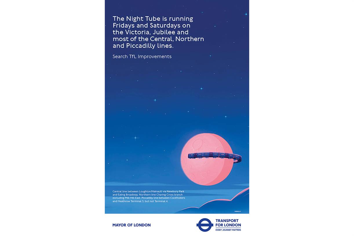
In figure 2 it can be seen the same style has been used
again, with the information at the top being the largest part of the text on
the page and therefore the focal point of the piece. This is then followed by
smaller strapline/call to action and subsequently leaving an image in the
bottom right-hand corner. Flat illustrations again used Herbert to add depth
and also reaffirm what the information on the poster is saying a gradient has
been used to represent a night-time sky. Further information is found in the
bottom left-hand corner which can be looked into by the audience at a later
date.
 |
| Figure 3 |
 |
| Figure 4 |
 |
| Figure 5 |
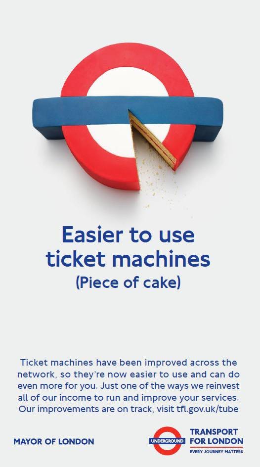
In figure 3 to 5, an alternate act of imagery used. Rather
than the colour scheme being taken from the digital platforms in which TfL have
applications and websites in, which can be seen in the first two examples, the
colour scheme is reverted back to the traditional red white and blue logo of
TFL for itself. The imagery used in each of the examples depicts what is
happening in the example itself. This is breaking its more modern rules of
using flat illustration and bright colour to be able to bring to life what the
campaign is saying. Although each poster is representative of the exact wording,
I believe it could be made more visually relevant to the branding of the travel
and the network itself through having a consistent visual style. This is a
considerable need to take into account when creating my campaign.
The typography throughout of the same, using Johnston 100
for any large headings or subheadings/straplines. Anybody text is done in the
aerial typeface; this is to ensure clarity of the information that is being
provided to the consumer. Reflecting on that is on the design styles and rules
of the digital campaigns which TfL have also published.


No comments:
Post a Comment